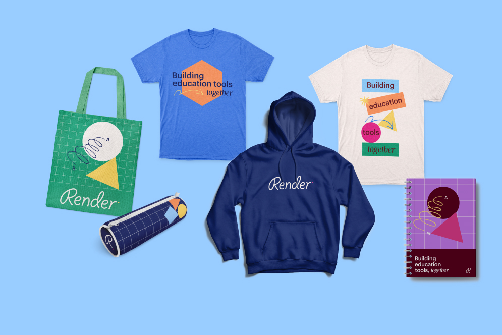
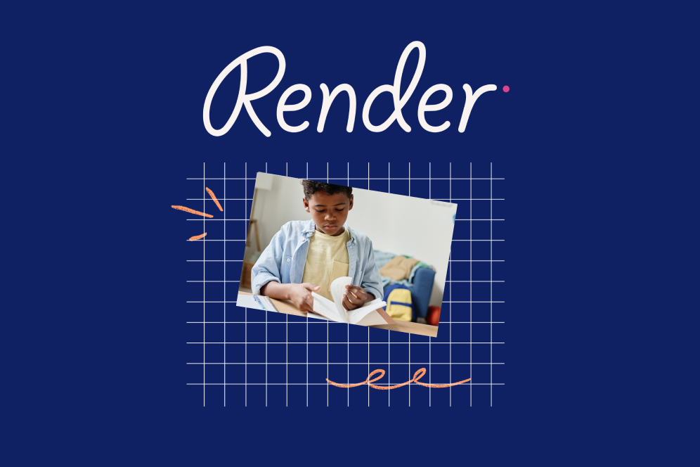
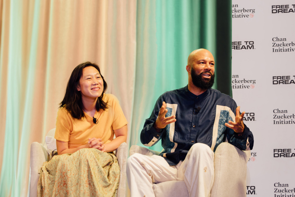
As CZI’s edtech innovation studio, Render brings together educators, partners, and developers to co-build better classroom tools.
In preparation of launching Render, it was crucial to establish a brand that could embody the promise of co-building and one that would resonate with educators. Not only did the brand need to bring to life the “why” of Render, but it also had to flex across many potential project prototypes, user interfaces, and marketing materials to create a unified, holistic experience for our educators.
Here’s a behind-the-scenes look at how we built the Render brand — the same way we build our classroom and district tools — collaboratively with teachers and educators.
A Research-Driven Approach
Our method for building the Render brand was rooted in analysis. It began with internal stakeholder sessions across our organization to gather ideas and hypotheses on how the brand should look, sound, and engage with educators.
With these insights shaping our research stimulus, we launched our first round of external research — engaging school leaders and teachers to gather their perspectives on co-creating classroom tools. Our goals for this initial study were twofold: first, to identify the clearest and most resonant ways to communicate the Render offering; and second, to understand what might motivate educators to participate in co-building.
The first round confirmed that educators were excited about the prospect of co-building, seeing it as a new framework for edtech development with the potential to meaningfully impact their students.

Our four sacrificial concepts born from our internal and external research
One school leader summed it up:
“Ultimately, what we're talking about here is changing the trajectory of the relationship between public education, private enterprise, and nonprofit. That’s a transformational approach to how a public school relates to research entities and product development. I think we’re woefully behind, so to me this is really exciting.”
Guided by educators’ feedback, we refined the brand’s positioning, design principles, and personality. We then launched a second round of research — presenting three distinct directions for the brand: one focused on optimism and collaboration, another emphasizing our mission, and a third centered on innovation. This allowed us to gauge educators’ impressions and identify which color palettes, photography styles, graphic elements, layouts, messaging, and word choices resonated most.
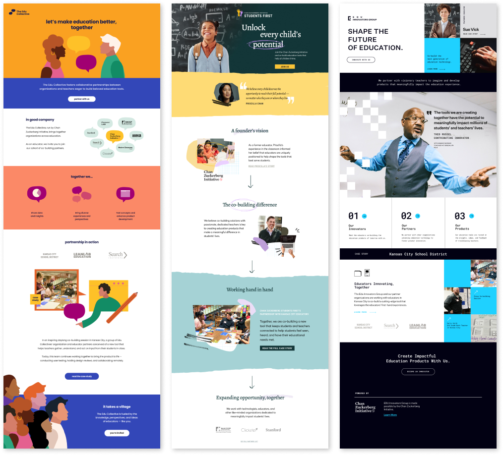
Mockups of the three landing pages we tested with educators
The Final Brand
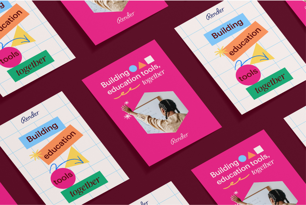
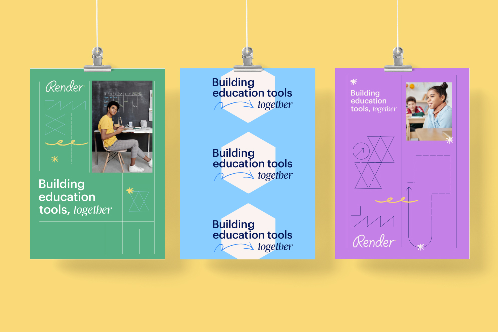
We carried these insights into the final brand design and established core design principles — guidelines and guardrails to help steer strategic decisions and ensure consistency across all expressions of Render.
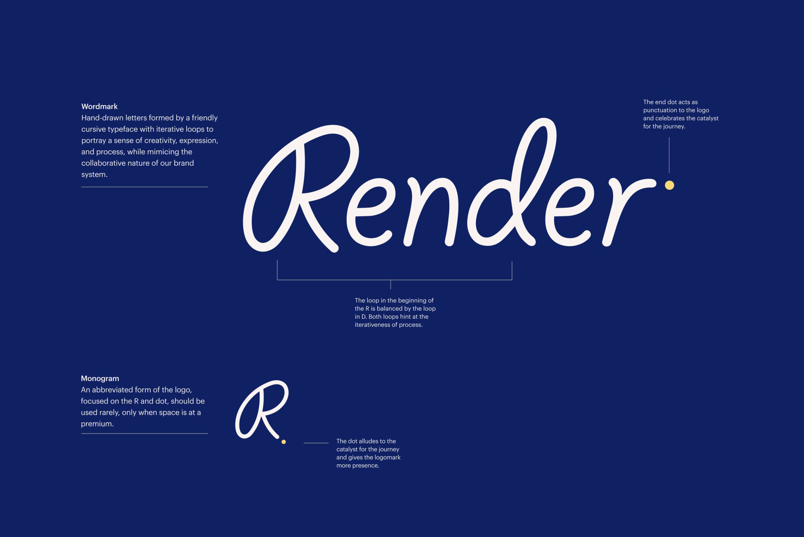
With our final strategy in place, we unveiled the Render brand at Gradient Summer Training. The name “Render” was chosen for its meaning: “to cause to be, to make, or to provide or give a service; to realize a vision; to co-build and bring an impactful product to life” — which is closely aligned with our mission.
Render’s visual identity was loosely inspired by the concept of blueprints — essential to any building process — the design combines the structured lines of an architect with the free, open-ended marks of a designer at work. This visual language reflects Render’s core philosophy: a commitment to continuous learning and adaptation in partnership with educators.
